Toggle navigation
All reports
Policy
Analysis
Investigations
About
Contact
×
Subscribe
×
Stay informed
Get new reports by email
Free to sign up. No spam or advertising. Cancel anytime.
Name (optional)
Email
Subscribe
Leave this field empty
Home
›
Infographics
Posts tagged "Infographics"
All reports
Policy
Analysis
Investigations
Budget
Corporation Tax
VAT
Income Tax
Property Tax
Inheritance Tax
National Insurance
Tax Avoidance
Fraud
SLAPP
Companies House
Infographics
Marginal Rates
Wealth Tax
Council Tax
SDLT
Stamp Duty
DOTAS
Show all +
Hide all –
Toggle search
Jan 14, 2026
Analysis
The Scottish Budget – four thoughts on a tiny tax cut
The Scottish Budget was on 13 January 2026. The flagship policy is being widely reported as a cut in income tax for low earners, by increasing thresholds from 2026/27. The 20% basic rate will now start at £16,538 instead of £15,398. The 21% intermediate rate will now start at £29,527 instead of £27,492. This is […]
Nov 27, 2025
Analysis
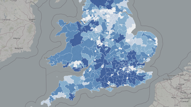
The mansion tax map: where the money comes from
We’ve modelled the impact of the English “mansion tax” by analysing land registry data on every property transaction since 1995. This lets us estimate how much each postcode and Parliamentary constituency will pay. It’s an approximate and lower-bound estimate – see methodology details below. As property taxes are devolved, there’s currently no mansion tax in […]
Nov 12, 2025
Policy
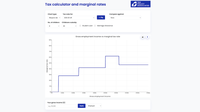
The Budget 2025 tax calculator
This online calculator calculates your tax on employment, self-employed or partnership income, and shows how it changes under a variety of Budget proposals. It charts the marginal and effective tax rate at all income levels, and shows where you fall on that chart. Now updated for the actual Budget, with rates for 2026/27 rates and […]
Jun 27, 2025
Analysis
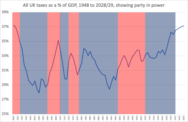
Are UK workers over-taxed? The answer in four infographics
There’s a tax paradox in the UK. Overall, we’re paying more tax as a percentage of GDP than at any time since the 1940s – and most people believe they’re over-taxed. Yet, at the same time, the average UK worker paid less tax on their wages in 2024 than any year since the War, and […]
Mar 19, 2025
Analysis
50,000 UK companies are unlawfully hiding their true owners
UK company law requires every UK company to disclose the individuals who control it – their “person with significant control” (PSC). But the rules are widely ignored. We’ve found that around 50,000 UK companies hide their true ownership by unlawfully listing a foreign company as their PSC – that’s not permitted. And we’re publishing an […]
Sep 24, 2024
Analysis • Infographics
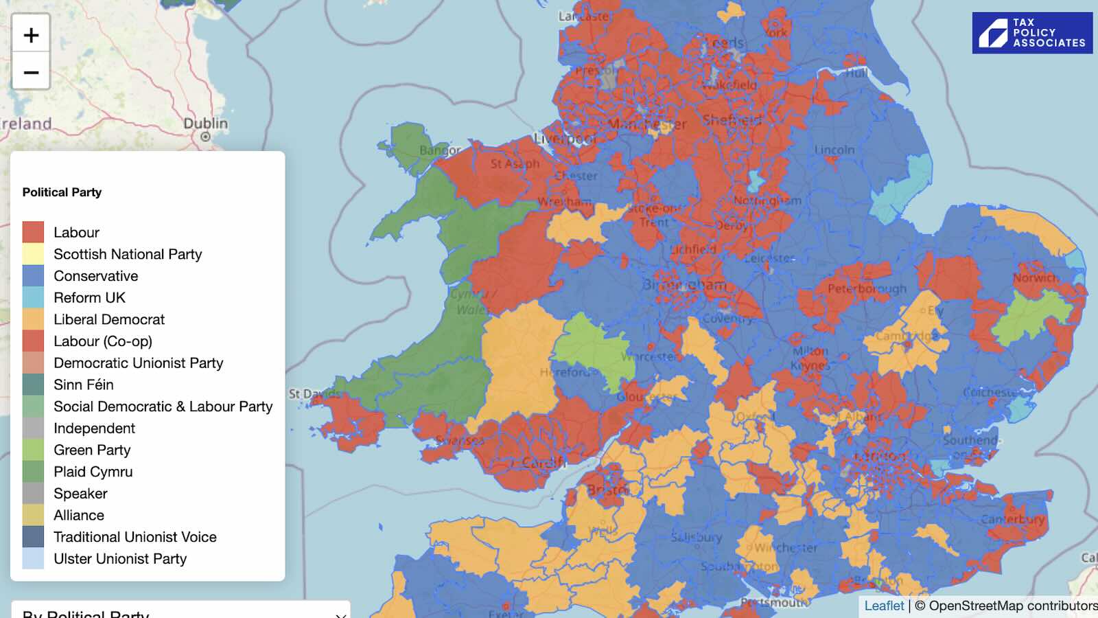
Map of MPs’ donors and interests
Which MP is the highest earner? Who receives the highest donations? Who takes the most foreign trips? We’ve just launched an interactive map that lets you explore all this and more. Apologies – this is currently down… the map needs to be updated. We hope to get to this soon. There’s an important political debate […]
Jun 6, 2024
Analysis
Why the general election tax debate is irrelevant
The general election tax debate has been irrelevant. The few £bn being discussed is dwarfed by the actual tax UK tax increases over the last few years, and the further tax increases we’ll almost certainly see in the future. I summarised this point on Sky TV on Wednesday. Here’s all UK taxes paid in 2023-24: […]
Feb 28, 2024
Policy
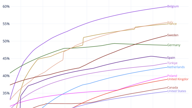
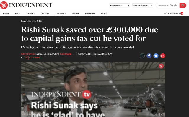
The UK tax system favours capital gains. Is it an outlier?
The recent publication of Rishi Sunak and Keir Starmer’s tax returns brought into focus the large difference between the marginal rates of tax on employment income (47%) and capital gains tax (20% for shares; 28% for real estate). Many people propose closing this gap. But how unusual is it in an international context? What do […]
Sep 25, 2023
Analysis
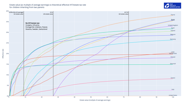
How does UK inheritance tax compare with other countries?
The OECD tax database has data on inheritance tax systems across the world, and we can use that to plot theoretical estate/inheritance tax effective rates in each country. In other words, for estates going from 1x average earnings to 100x average earnings, how much tax does the estate pay, as a % of estate value? […]
Load more
Stay informed
Get new reports by email
Free to sign up. No spam or advertising. Cancel anytime.
Name (optional)
Email
Subscribe
Leave this field empty