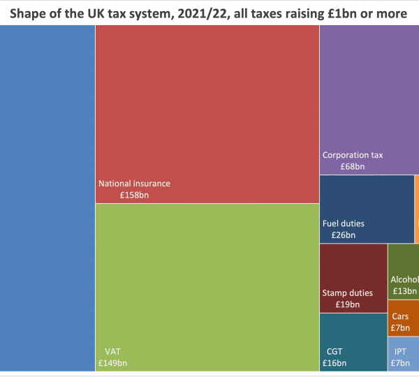
The chart above shows the composition of the UK tax system – the contribution made by each of the different taxes.1
It must have seen dramatic changes over the last forty years:
Not really:2

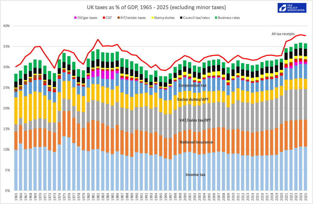
Or, over a longer period, and as a % of GDP:3
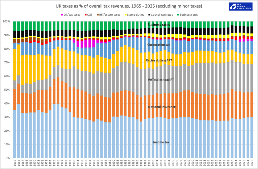
The same data, but normalised so it shows the share of overall taxation:4
Obvious conclusions:
- The conventional wisdom that tax has moved from taxing income (income tax/NI) to taxing consumption (VAT) is correct – but only to a degree. The decline in income tax/NI is small, and the increase in VAT has been almost matched by a decrease in other indirect taxes/duties
- The conventional wisdom that corporation tax has been slashed (the “race to the bottom“) is wrong
- The complaint that business rates are at historically high levels is wrong
- The idea that the EU forced VAT on us, and changed our tax system forever, is also wrong. VAT replaced the various sales taxes, and caused a massive drop in excise duties. The combined total of VAT/sales taxes/duties hasn’t materially changed since the 60s.
- Council tax/poll tax/rates revenues look much the same, despite the very significant changes over this period
How does it compare with the rest of the OECD?
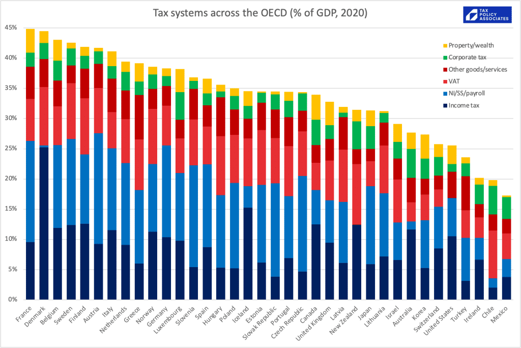
That looks like this:5
Comparisons are easier if we normalise, and order by the total % of tax collected in income tax and social security/national insurance:6
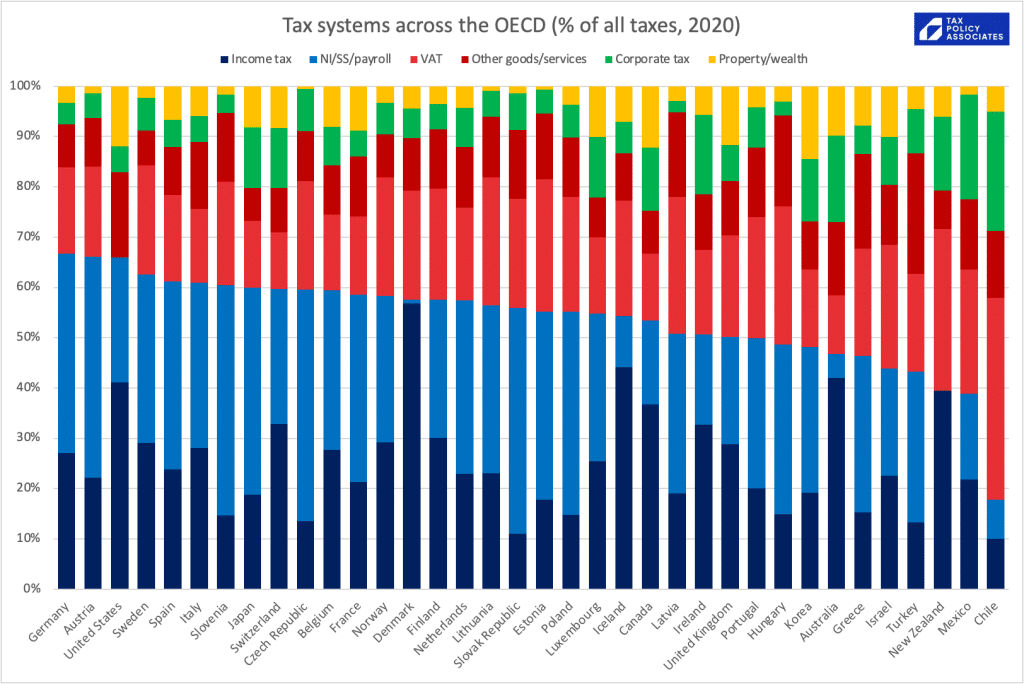
We need to be cautious about these comparisons. There are services which are paid for out of general taxation in some countries, but paid for directly by individuals in others. The obvious large example is healthcare in the US – about 55% of which is paid for by businesses and individuals rather than the Government. A smaller but still significant example is local services: some (e.g. rubbish collection) are paid from council tax in the UK, but by direct fees in some Continental countries.
With that large caveat, what can we conclude from these charts?
- The tax system most similar to the UK is Portugal, which I find surprising – although Portugual collects somewhat more in VAT and other indirect taxes, and the UK collects somewhat more in capital/land taxes
- Amongst the countries similar to the UK – large developed economies with relatively generous welfare states, the UK has the smallest overall tax as a % of GDP, the smallest overall tax % collected from individuals/wages, and the largest from capital/land taxes.
We shouldn’t exaggerate these differences. There are obvious large variations in total tax as a % of GDP between countries, but it’s remarkable how – aside from a couple of outliers7 – the differences in tax composition between countries is relatively small.
Another way to look at this is to plot the % of tax on the wages of the average worker (i.e. income tax, and employee/employer’s national insurance only) against the level of state spending in each OECD country:8 or, more courageously, choosing to significantly increase or decrease the size of the state, and therefore decrease or increase most people’s taxes, and the public services they fund.
Footnotes
Sources are here for most of the taxes, here for local government taxes and here for vehicle excise duty (the latter being a forecast, not an outturn) ↩︎
Thanks to the IFS who did all the work here – I just bundled similar taxes together and plotted it ↩︎
Ignoring minor taxes; there are dozens, and they make the chart unreadable. ↩︎
Again ignoring minor taxes. ↩︎
Thanks to the OECD for the wonderful global revenue statistics database. I just categorised similar taxes together – but had to push the taxes into a smaller number of categories than for the UK-only charts above, or cross-country comparisons became impossible. ↩︎
I’m bundling employer and employee SS/NI together, because all the evidence is that, in the long term, employees bear the economic burden of employer labour taxes, i.e. because a business will generally keep its overall labour costs constant as taxes increase, so take-home wages fall (Again, in the long term) ↩︎
Chile! ↩︎
This is now updated using the latest OECD data for 2022. I’ve removed Ireland because of the well-known problems with Irish GDP data, and excluded Chile because it is so great an outlier that it makes the chart hard to read./mfn]
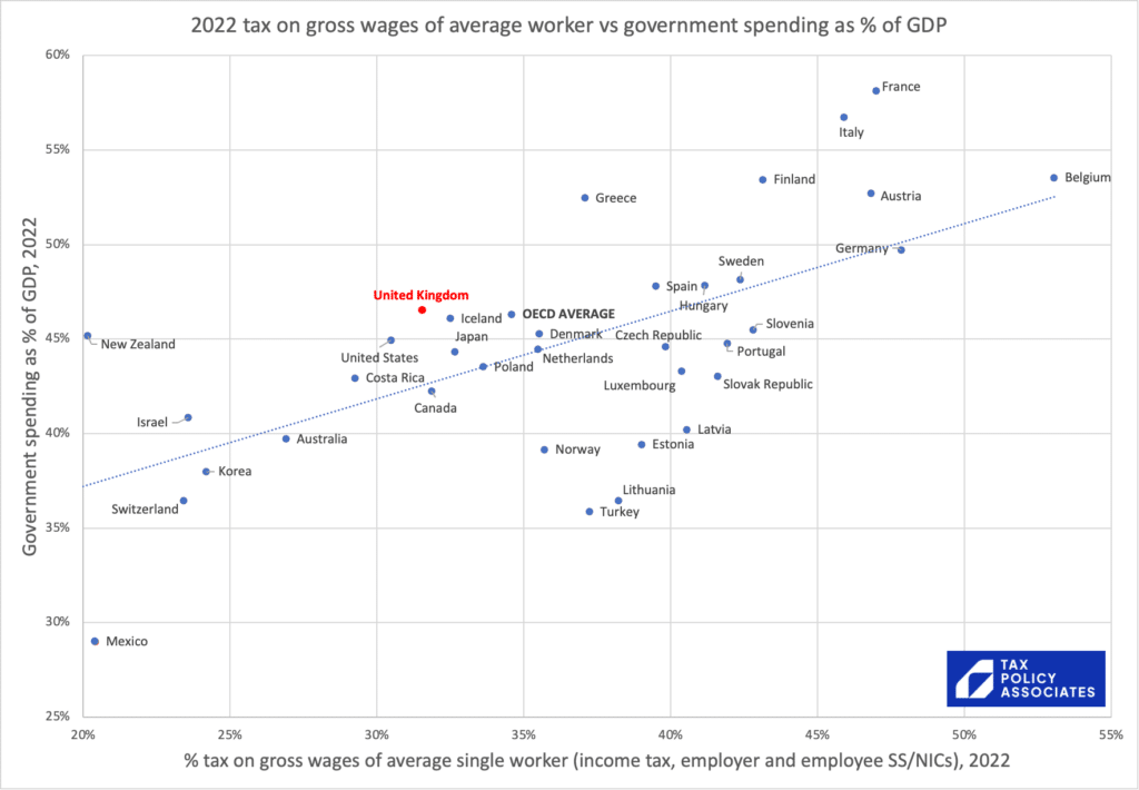
It’s notable that there’s no country in the world which taxes the average worker less than the UK, but has higher government spending.
We should therefore be sceptical of anyone who claims that we can radically change the balance of taxation and [eliminate corporate tax][tax corporates more and people less][tax land more and everything else less]. International experience suggests our options are limited to fiddling at the margins here and there8Don’t knock it! -almost everything I write is about fiddling at the margins ↩︎
2 responses to “The UK tax system in five infographics, and what we can learn from the fact they are boring”
One of the constant themes of economic policy in the UK is that by cutting taxes you can increase productivity – the notion is simplistically that if people have to pay less tax of what they earn, they will work harder.
You’ve made the excellent point in the past that the way the UK VAT system works discourages productivity.
But looking more widely, could you do a similar make of overall taxation against productivity?
‘The conventional wisdom that corporation tax has been slashed (the “race to the bottom“) is wrong’
Remember Sherlock Holmes – the Dog that did not Bark.
Proportion of GDP taken by Corporation Tax has not changed.
But returns to capital have increased relative to returns to labour, so OTBE, one would expect the proportion taken by CIT to have gone up.
Therefore the effective UK rate on effective profit has gone down.
(effective profit, because HMRC and CH profits only show those booked in the UK, and much more is now booked outside the UK.