UK tax as a percentage of GDP is on course to be the highest since 1945. Over the next four years it will increase further. Government spending won’t increase as a percent of GDP over this period; given the ageing population, that means public services for most people are likely to decline. This article looks at international data to explain why that is, and why the UK is such an outlier.
The international data in this article is taken from the latest IMF World Economic Outlook database, published in April 2026.
The level of UK tax
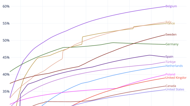
UK tax is the highest it’s been since 1945. I expected we’d see similar trends across other countries – but we don’t.
This chart shows government revenue (basically: tax1) as a share of GDP, both historic data2 and a forecast through to 2030 (for the UK that’s using OBR figures):3
(This and all the other charts here are interactive; you can add/remove countries by clicking on the legend, and see exact details by hovering over/touching datapoints. On mobile devices the “fullscreen” button (top right) will make things clearer. You can also download an image of the chart, or the raw data, using the icons at the top right.)
The projected increase from 2025 to 2030 is 3.6% of GDP – so, by 2030, tax will be about £100bn a year higher than today. This is a very substantial sum – roughly equivalent to raising the basic and higher rates of income tax by 10p.
There are many countries with higher overall levels of tax than the UK, but the UK is an outlier in the degree to which its overall level of tax is increasing from 2025 to 2030.
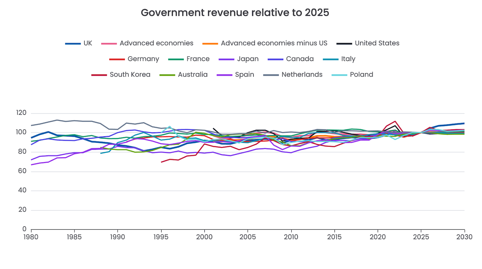
The UK’s uniqueness stands out if we put all the countries in our dataset onto a chart of revenue as a % of GDP, normalised to each country’s 2025 position. Most other countries are broadly flat. A few, like Spain and Poland, rise modestly. The UK emerges from the crowd and soars upwards.4
So the UK is an outlier. The question is: why?
(One important note: the figures to 2030 are forecasts, from the OBR in the UK and equivalent bodies or finance ministries in other countries. They are uncertain, and highly contingent on policy choices. They show the path implied by current assumptions – they are not destiny.)
Is it because of GDP?
A common explanation is that the UK’s tax problem is actually a growth problem: our growth has been lacklustre, and so with demographic trends pushing costs upwards, tax as a % of GDP can only rise over time.
That seems plausible when looking at this chart from the Financial Times, showing GDP per capita in US dollars at purchasing power parity5:
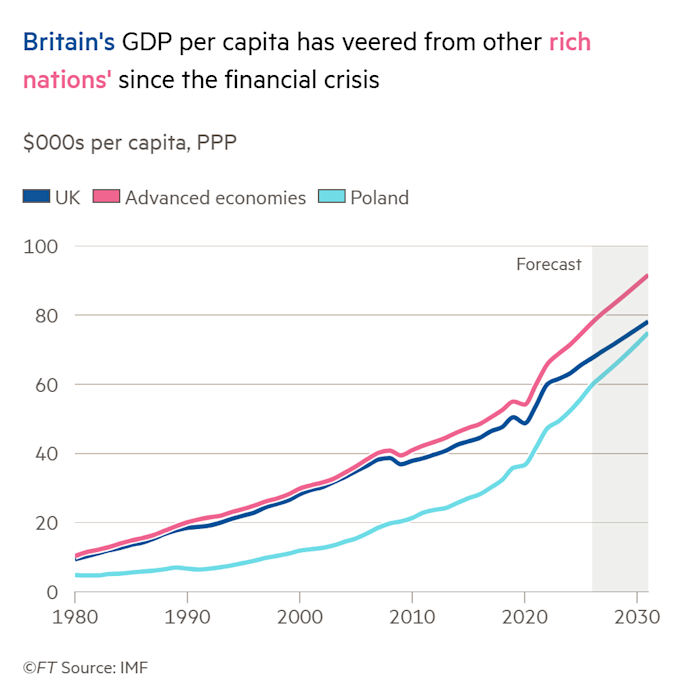
The problem is that there is nothing very unique about the UK’s GDP position. If we use exactly the same data source but separate the US from every other advanced economy, we see that the UK is only slightly behind the crowd:6
So the UK is actually pretty typical; it’s the US that’s the outlier.7
We see these trends in the overall GDP data as well as GDP per capita. This chart normalises each country’s GDP to 2025 so we can see the international comparisons clearly – and the UK is, again, just very slightly below other advanced economies (excepting the US). Indeed the UK trend is so close to other advanced economies (minus US) that it’s hard to distinguish the two lines on the chart:8
So whilst UK growth has been anaemic, that doesn’t make the UK an outlier. The trend of rising UK tax (as a % of GDP) from 2025 to 2030 is not a simple GDP-denominator effect.
This is not an article about why UK growth has been weak – the various contested factors of Brexit, planning, investment, skills, immigration (too much or too little), and others are outside both the scope of this article and my expertise. The narrower point is that weak growth does not, on this IMF data, explain why the UK is such an outlier for forecast tax increases. The trend of rising UK tax (as a percentage of GDP) from 2025 to 2030 is not a simple GDP-denominator effect.
Is government spending going up?
The obvious explanation for the rise in tax as a percentage of GDP from 2025-30 is that Government spending will be going up as a percentage of GDP.
But it isn’t.
Government spending in the UK, and most other countries, is broadly flat (as a percentage of GDP) from 2025 to 2030:9
The apparently straight line for the UK over 2025-2030 disguises a lot of movement. Demographic change means that health, pension, and social care spending continue to rise. Defence spending will likely rise. That means other areas are likely to see real-terms cuts.
There was a massive increase in UK Government expenditure during the pandemic. In 2019, before Covid, UK government expenditure was about 38.3% of GDP. It then peaks at 49.3% in 2020, dropping to 43.7% in 2024. By 2030, the IMF forecast is 43.6%. So around half the Covid-era increase in expenditure is forecast to become permanent.
Some of the post-Covid expenditure comprises interest payments on Government debt (which rose due to both increasing interest rates and increasing levels of debt). Some of it represents a real step-change in government expenditure levels – but I think most people would say the step-change did not create an improvement in public services.
The UK is unusual in the scale and persistence of this effect. That’s clearest if we normalise each country to the pre-pandemic 2019 position:10
Of the largest advanced economies, only the UK shows this pattern: a massive increase in spending during the pandemic, half of which became a permanent feature. (Poland also shows a large increase, but it does not look like the same phenomenon: it is less obviously a post-pandemic ratchet, and more plausibly part of Poland’s broader catch-up with richer European economies.)
I’ll leave others to comment on the reason for the UK’s remarkable rise in spending11, but it wasn’t accompanied by material tax increases at the time. The obvious consequence was that UK government gross debt jumped in 2020, and now sits on a much higher12 plateau:13
And we are now paying for that in two ways.
First, higher debt interest is already inside the expenditure numbers. It was 3.7% of UK government expenditure in 2019, 6.0% in 2025, and is forecast to reach 7.0% in 2030. That’s high by international standards, although the Italy is higher and the US much higher:14
Second, from 2025-30, the UK is reducing government borrowing significantly, whilst not increasing spending (as a % of GDP) at all. The position in other countries is very different – whether that reflects necessity or choice is not clear to me:15
That’s why the UK is, by some way, the large advanced economy with the highest16 forecast deficit reduction:17
That’s the answer. The increased tax in 2025-2030 is not paying for increased expenditure in 2025-2030. It’s paying to reduce borrowing, and stabilise the debt burden that the UK took on to increase its expenditure during and after the pandemic. Meanwhile, debt interest is already inside the expenditure line, reducing what is available for public services.
This is not an original diagnosis. The broad picture has been well covered: the IFS has long described the UK’s high-by-historical-standards tax burden and the spending pressures behind it; the Resolution Foundation has argued that the UK tax take is rising and likely to stay high; Torsten Bell has made the linked point that higher taxes can coexist with deteriorating public services because of debt interest and other pressures; and the OBR has put the same fiscal squeeze in official terms.
What does this mean?
The position the UK is in is a political and economic choice. There are other choices that could be made:
- Instead of keeping expenditure level (as a percentage of GDP), we could cut expenditure to its pre-pandemic levels (or further), and fund tax cuts.
- We could increase expenditure, funded either by cutting other areas (politically difficult as that may be) or by tax increases.
- Or we could increase expenditure, and/or fund tax cuts, by abandoning the current course of deficit reduction. Either settling for more modest deficit reductions, or not even trying to reduce the deficit. I don’t know how much freedom we have here. The US seems to be able to run up debt without consequence – the UK probably cannot.
I don’t know whether the third course is wise; I fear that politically it may be hard to resist. There are few politicians calling for spending cuts or tax increases, but it’s unclear to me that the electorate will go along with escalating taxes, and public sector workers will agree to real-terms pay freezes, against a backdrop of deteriorating public services.
We could escape this unpleasant set of options if we had higher growth; but growth is not something governments can summon by decree. It requires accepting trade-offs, and my view is sadly that our politics has repeatedly failed that test.
The Conservatives abandoned mandatory local housing targets under backbench pressure. Labour has chosen politically alluring but anti-growth tax increases and employment law changes. The Liberal Democrat leadership tried to scrap national housebuilding targets to court anti-development voters. And politicians of all parties are happy to oppose large energy projects when the local politics is difficult.
None of these decisions was decisive on its own. Together they show why it is much easier to promise growth than to accept the choices required to achieve it. Until this changes, I fear that taxes will continue to rise, and public services will continue to decline.
Many thanks to H for help with the macroeconomics, P and K for help with IMF statistics and A for coding assistance.
The interactive charts in this report are rendered using Apache ECharts, an open source JavaScript visualisation library maintained by the Apache Software Foundation and its contributors. Apache ECharts is licensed under the Apache License 2.0. © 2017-2026 The Apache Software Foundation. WordPress plugin, © 2026 Tax Policy Associates Ltd.

The Scottish Budget – four thoughts on a tiny tax cut
The mansion tax map: where the money comes from
The Budget 2025 tax calculator
Are UK workers over-taxed? The answer in four infographics
50,000 UK companies are unlawfully hiding their true owners
Map of MPs’ donors and interests
Footnotes
The IMF makes a distinction between taxes, social contributions and other government revenue. In the UK, national insurance is clearly a tax – there’s only a tangential relationship between the amount paid in and the amount of any final state pension entitlement. In many other countries the relationship is more direct, and so looks less like “tax” – but for an apples-to-apples comparison it makes sense to put everything together. “Other government revenue” is sufficiently small over the timescale we’re looking at that it doesn’t change the overall picture. ↩︎
The IMF WEO revenue data has uneven historical coverage. The UK series begins in 1980, but the advanced-economies aggregate, the United States, and the calculated advanced-economies-minus-US series begin in 2001. The chart keeps the full 1980-2030 range so that the available UK history and the IMF forecast period are both visible. ↩︎
IMF WEO general government revenue, percentage of GDP, 1980-2030. Data source: IMF World Economic Outlook, April 2026. This chart uses annual WEO rows for
GGR_NGDP, “Revenue, General government, Percent of GDP”, for the UK (GBR), selected comparator countries, and the WEO country-group rowG110, “Advanced Economies”. The “Advanced economies minus US” line is not an IMF-published series: it’s calculated by converting the IMF percentage-of-GDP revenue ratios into revenue amounts using WEO nominal GDP in US dollars (NGDPD), subtracting the US amount and US GDP from the advanced-economies aggregate, and recalculating the ratio. The chart keeps the WEO calendar-year range 1980-2030, but some country and aggregate fiscal series begin later because the IMF data coverage is uneven. ↩︎IMF WEO general government revenue, 2025 = 100, 1980-2030. Data source: IMF World Economic Outlook, April 2026. The chart uses annual WEO rows for
GGR_NGDP, “Revenue, General government, Percent of GDP”, for the UK (GBR), selected comparator countries, and the WEO country-group rowG110, “Advanced Economies”. For each country or aggregate, the 2025 revenue share of GDP is set to 100, and all available years from 1980 to 2030 are shown as value = revenue share of GDP in that year / revenue share of GDP in 2025 x 100. ↩︎PPP/purchasing power parity adjusts for differences in price levels between countries, so that the figures are closer to a comparison of what income can buy in each country, rather than a comparison based only on market exchange rates. The figures are expressed in current international dollars. A country with a higher figure is estimated to have higher GDP or GDP per capita after allowing for local prices. If market exchange rates are used then the data is dominated by fluctuations in exchange rates – it also fails to reflect that a dollar in (say) Norway buys much less than a dollar in (say) Thailand. ↩︎
IMF WEO PPP GDP per capita, $000s, 1980-2030. Data source: IMF World Economic Outlook, April 2026. This chart uses WEO indicator
PPPPC, “Gross domestic product (GDP), Per capita, purchasing power parity (PPP) international dollar, ICP benchmarks 2017-2021”, for selected countries and the WEOG110“Advanced Economies” aggregate. “Advanced economies minus US” is, again, calculated: we use WEO total PPP GDP (PPPGDP) and GDP per capita (PPPPC) to infer population for the advanced-economies aggregate and for the US, subtract the US from the aggregate, and then recalculate GDP per capita for the remaining advanced economies. ↩︎As are a handful of small wealthy countries – Switzerland, Luxembourg and a few others. But of the large countries, only the US bucks the trend. ↩︎
IMF WEO PPP GDP, 2025 = 100, 1980-2030. Data source: IMF World Economic Outlook, April 2026. This chart uses WEO indicator
PPPGDP, “Gross domestic product (GDP), Current prices, Purchasing power parity (PPP) international dollar, ICP benchmarks 2017-2021”. For each country or aggregate, total PPP GDP in 2025 is set to 100, and all available years from 1980 to 2030 are shown as value = total PPP GDP in that year / total PPP GDP in 2025 x 100. “Advanced economies” is WEO groupG110. “Advanced economies minus US” is calculated as WEOG110total PPP GDP minus WEO US total PPP GDP before normalising to 2025. ↩︎IMF WEO general government expenditure, % of GDP, 1980-2030. Data source: IMF World Economic Outlook, April 2026. This chart uses WEO indicator
GGX_NGDP, “Expenditure, General government, Percent of GDP”, for selected countries and the WEOG110advanced-economies aggregate. “Advanced economies minus US” is calculated as a GDP-weighted expenditure ratio: the WEO expenditure percentages are converted into expenditure amounts using nominal GDP in US dollars (NGDPD), the US amount and GDP are subtracted from the advanced-economies aggregate, and the expenditure-to-GDP ratio is recalculated. ↩︎IMF WEO general government expenditure, 2019 = 100, 1980-2030. Data source: IMF World Economic Outlook, April 2026. This chart uses the same WEO indicator as the preceding expenditure chart:
GGX_NGDP, “Expenditure, General government, Percent of GDP”. For each country or aggregate, the 2019 expenditure share of GDP is set to 100, and all available years from 1980 to 2030 are shown as value = expenditure share of GDP in that year / expenditure share of GDP in 2019 x 100. ↩︎That debate often reflects political priors; but an under-examined issue is that the way the UK’s public debt is structured may have made us more vulnerable than other countries to economic shocks (particularly our high, by international standards, issuance of index-linked gilts) ↩︎
Note that the immediate hit to GDP during the pandemic meant that the debt/GDP peak at that time can give the misleading impression that it has since come down; in reality GDP has recovered, but there has been no reduction in the nominal amount of debt. ↩︎
IMF WEO general government gross debt, % of GDP, 1980-2030. The IMF WEO gives both gross and net general government debt. Gross debt is usually the better headline international comparison, because net debt definitions depend heavily on what financial assets are counted and how they are valued. Even gross debt is not perfect, but it is the cleaner cross-country starting point. Data source: IMF World Economic Outlook, April 2026. This chart uses WEO indicator
GGXWDG_NGDP, “Gross debt, General government, Percent of GDP”. We use gross debt rather than net debt for the headline cross-country comparison because net debt depends more heavily on national definitions of government financial assets. “Advanced economies” is WEO groupG110. “Advanced economies minus US” is calculated by converting debt ratios into debt amounts using nominal GDP in US dollars (NGDPD), subtracting the US debt amount and GDP from the advanced-economies aggregate, and recalculating the gross-debt-to-GDP ratio. ↩︎IMF WEO implied debt interest as a share of general government expenditure, 1980-2030. Data source: IMF World Economic Outlook, April 2026. The chart derives debt interest from WEO indicator
GGXONLB_NGDP, “Primary net lending (+) / net borrowing (-), General government, Percent of GDP”, minusGGXCNL_NGDP, “Net lending (+) / net borrowing (-), General government, Percent of GDP”, and divides the result byGGX_NGDP, “Expenditure, General government, Percent of GDP”. This will therefore be a different figure from debt interest in the UK public finances, because it is derived from IMF primary and overall fiscal balances rather than taken from UK government accounts. The advantage is that it is calculated on a consistent basis across countries, enabling an international comparison. ↩︎Change in IMF WEO fiscal ratios, 2025-2030, percentage points of GDP. Data source: IMF World Economic Outlook, April 2026. The chart uses the IMF WEO country-group composition sheet to identify members of
G110, “Advanced Economies”, then selects the 20 largest advanced economies by 2025 nominal GDP in US dollars (NGDPD). It also includes the WEOG110advanced-economies aggregate and a calculated “Advanced minus US” aggregate. For each country or aggregate, values are calculated as 2030 minus 2025. “Increases in expenditure” is the change inGGX_NGDP, “Expenditure, General government, Percent of GDP”. “Reductions in borrowing” is the change inGGXCNL_NGDP, “Net lending (+) / net borrowing (-), General government, Percent of GDP”; because IMF net lending equals revenue minus expenditure, a positive movement in net lending means a smaller deficit and therefore a need for more revenue, all else equal. “Advanced minus US” is calculated by converting the WEO percentage-of-GDP ratios into amounts using nominal GDP (NGDPD), subtracting the US amount and US GDP from the advanced-economies aggregate, recalculating the ratio, and then taking the 2030 minus 2025 change. ↩︎Hong Kong’s is actually larger, but a rather special case. ↩︎
IMF WEO general government net lending (+) / borrowing (-), % of GDP, 1980-2030. Data source: IMF World Economic Outlook, April 2026. This chart uses WEO indicator
GGXCNL_NGDP, “Net lending (+) / net borrowing (-), General government, Percent of GDP”. Positive values are net lending/surplus; negative values are net borrowing/deficit. “Advanced economies minus US” is calculated using the same GDP-weighted method as the revenue and expenditure charts: convert the percentage-of-GDP balance to an amount usingNGDPD, subtract the US from WEOG110, and recalculate the percentage of GDP. ↩︎
Leave a Reply to Observer Cancel reply