We’ve modelled the impact of the English “mansion tax“1 by analysing land registry data on every property transaction since 1995. This lets us estimate how much each postcode and Parliamentary constituency will pay. It’s an approximate and lower-bound estimate – see methodology details below. As property taxes are devolved, there’s currently no mansion tax in Wales and Scotland – although I rather expect there will be soon.
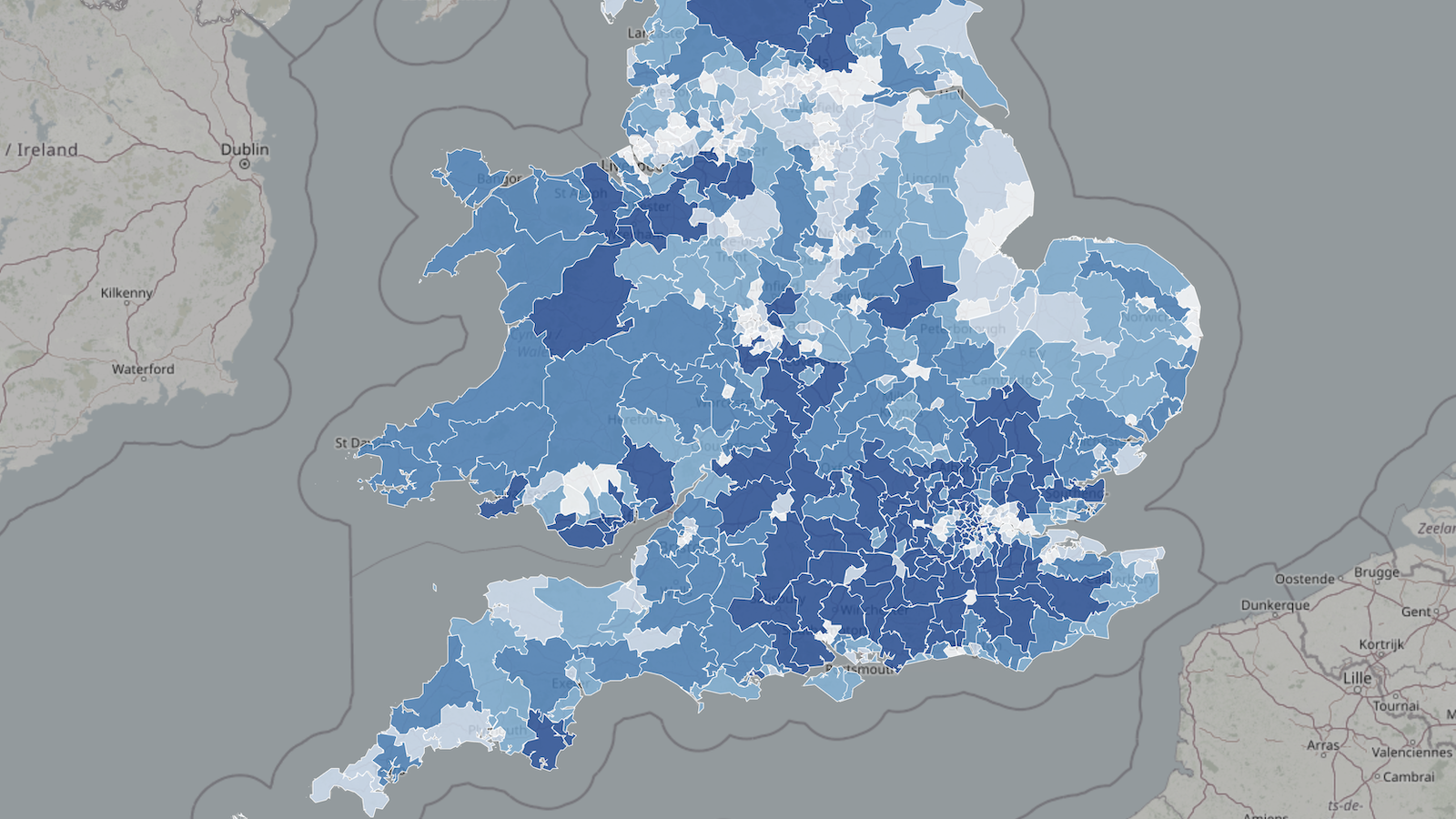
This interactive map shows the results of our model, marking every postcode that contains “mansion tax” properties. It also shows English and Welsh data2 on the current council tax bands, median house prices, and the changes in house prices since 1995 (which demonstrate quite how out of date council tax is):3
You can view the map fullscreen here. It’s important to stress that this is only showing postcodes – the markers on the map are at the centre4 of the postcode and do not represent individual properties.
This chart shows our estimate of the revenue from the mansion tax for each constituency. You’ll be unsurprised to see that most affected properties are in London (you can move the mouse over individual constituencies to see full details).
My view is that the tax is good policy. There will be inefficiencies and unfairnesses, as with all taxes, but the basic concept is right: ending the anomaly that someone in a £10m home pays the same council tax as someone in a £1m home – and only twice the council tax of someone in a £400k home. I wrote more about my views here.
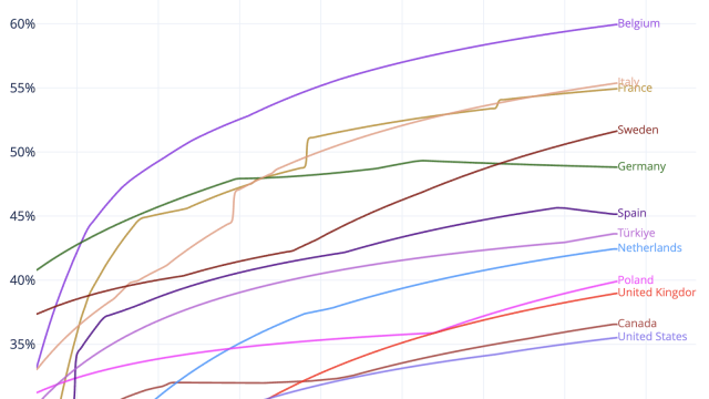
This chart shows how the “mansion tax” makes council tax somewhat more progressive:
Methodology and limitations
Our methodology was straightforward: use the Land Registry price paid database to find every property transaction since 1995 that looks residential5, and uprate prices by the change in median house prices in each constituency (whilst also displaying council tax data).
The code for the analysis and webapp is available on our GitHub.
It would be technically straightforward for our analysis and map to show the estimated value and mansion tax for individual properties, but we were uncomfortable with the privacy implications (although there are many property price websites that let you see “price paid” data for specific properties). We therefore limit the map to postcodes (which has the side benefit of making the app load and respond much faster).
Our very simple approach has obvious limitations:
- The open Land Registry data doesn’t include title numbers or other identifiers for properties. So we have to “de-duplicate” repeated transactions in the same property, so we only count the most recent. This is error-prone and we err on the side of conservatism – we’ll therefore be missing some properties.
- The open Land Registry data also doesn’t differentiate between residential and commercial. We use the “Property Type” field which says whether a property is detached, semi-detached, terraced, flat/maisonette or “other”. In principle, “other” should be commercial property and the other types should be residential – but there will be numerous cases where this isn’t so. For example a farmhouse sold with the farm may be classified as “detached” and so caught in our data as if the full price related to the house, when realistically it won’t.
- Inflation is higher in some areas within a constituency than others
- We can’t take account of improvements etc to properties, conversions (e.g. where a property is split into flats), and any other changes after a sale.
- Our approach completely ignores properties that haven’t been sold since 1995.
- In some cases (particularly high value property) the price is hidden, or too low.
- Portfolio transactions are another problem – e.g. where multiple low value properties are acquired for a large £2m+ price, but no separate price is registered for each property. In that case the land registry sees each property as a £2m+ sale, and we end up with multiple false identification of “mansions”. We try to fix this by identifying when there are multiple purchases on the same postcode on the same date for the same price – but this won’t catch all such cases (e.g. where a portfolio transaction spans multiple postcodes). There isn’t an easy way to fix this.
Taken together, our approach is likely generating a lower-bound estimate of the actual static revenue from the tax. The total estimated revenue is £510m.6
This is much less than the OBR’s static revenue estimate of £600m – that will be because they used more sophisticated approaches, for example more granular house price inflation corrections, better detection of residential property, inclusion of properties that aren’t in the transaction data. The OBR then adjusts the static estimate to reflect behavioural effects (clustering below thresholds) and losses to other taxes – this brings their total estimated revenue to £400m.
So our figures, and our map, are missing properties and undervaluing properties, and that together amounts to an error of about 20%. We make no attempt to adjust for behavioural effects. So none of the figures we present will be individually accurate, but the overall picture should be an accurate reflection of the constituencies and postcodes from where the “mansion tax” revenues will come.
Contains HM Land Registry data © Crown copyright and database right 2025. This data is licensed under the Open Government Licence v3.0.
Footnotes
Strictly the “high value council tax surcharge” or HVCTS. ↩︎
Unfortunately it’s limited to England and Wales – the Scottish data is separate. ↩︎
Much worse in England than Wales, because England is still on the original 1991 valuations, but Wales revalued council tax in 2003. There was a huge amount of house price inflation in the 1990s. ↩︎
Strictly it’s the address-weighted centre, not the geometric centre. ↩︎
i.e. labelled as detached, semi-detached, terraced or flat/maisonette. Almost all of those are residential. Some of the other category (“Other”) will also be residential, but we’ve no way to screen those using only land registry data – typically one would use a commercial database to cross-check. Government/local authorities can of course use council tax/business rate records. ↩︎
The original version of this article said £400m. We’ve since improved the algorithm; it’s better at removing repeated transactions in the same property (i.e. because we only want to take the most recent). It’s also now using change in median detached house prices per constituency, rather than change in all median house prices. Detached houses are likely a better proxy for change in value of very expensive homes. ↩︎

The Scottish Budget – four thoughts on a tiny tax cut
Has council tax really gone up? The evidence.
The Budget 2025 tax calculator
Council tax on ‘expensive homes’ – but most of the money comes from the not-so-rich

Council tax on expensive homes: could the Budget raise £1bn+?
Leave a Reply to James Mackay Cancel reply